Personalized Tags for Kindle Users.
Adding a tagging feature to the Kindle library that provides users with a thorough and individualized organizational option.
Roles:
Product Designer, UX Researcher, and Visual Designer
Project Duration:
Three Weeks
Tools and Resources Used:
Figma, Whimsical, Miro, Wikimedia Commons, Kindle.
The project overview and background.
I was inspired by my recent work on Our Shelf to complete another project in the bookish sphere. Knowing I would be adding a feature to an existing product, the most logical choice would be a product I was already familiar with.
Kindle felt like the obvious answer—I read with Kindle daily, using the mobile app and my e-reader interchangeably depending on my environment. Many of my friends read with Kindle as well, so I knew I would have a user base to reach out to.
The issue I was most curious to interrogate in my research was organization. Kindle users often amass a sizable personal library over time. Items in one’s library can be searched for by title or author. Users can also filter items by their status (read or unread.) There is also a feature where users can add books to custom collections. The collections feature is more accessible on Kindle devices, but it’s hard to find when using the mobile app.
I am often frustrated with the limitations of Kindle’s current library organization. I have hundreds of items, and I’m not likely to recall the exact title or author’s name when searching for something. I wanted to learn if other users had similar frustrations, and what feature I could add to alleviate this.
Now that I had an idea, I started my research with user interviews.
All users interviewed for this project use Kindle (the mobile app, e-reader, or both) at least three times a week, often every day. I was only interested in hearing from those users who were already familiar with the product as I knew they would be more likely to have frustrations with Kindle and ideas for improvement.
The questions and responses illustrated below are a fraction of the full interviews conducted.
To establish a baseline I asked:
Are you familiar with the collections feature on Kindle?
Ella: “Yes, but I don’t use it. If you could search your library by the name of the collection you think a book is in, then I might.”
Asha: “No. What’s that?”*
Emily: “Yeah, I know it’s there but it just seems like a lot of work so I don’t use it.”
Divya: “Yes. I tried it when I first got my Kindle but stopped because it got tedious having to add books one at a time.”
Madeleine: “There’s a collections feature? Where?”*
*In both cases where users did not know the collections feature existed, I paused the interview to show them where to find it and how to use it if they wanted to. After learning about it, Madeleine and Asha both mentioned that they were not inclined to use this feature.
I was curious to see how folks intuitively organized their books, and how it compared to the Kindle library’s structure, so I asked:
Putting the Kindle aside for a minute, can you tell me about the physical books you own and how you organize them?
“I have so many books at home—several full bookshelves. It’s “organized chaos,” because I tend to change my organization systems at least once every year. I’ve tried doing it alphabetically, by genre, by mood. Currently, I have them organized by color and size.”
— Madeleine
“My bookshelf is too full, I need to get another one. I try to keep them organized alphabetically by author’s last name, but it doesn’t usually stay that way. The books I pick up aren’t usually returned to their “correct” place, but they end up in clumps based on what I felt like reading at the time.”
— Divya
“I have two and a half bookshelves at the moment. There’s a good amount I haven’t read yet. Those have their own shelf. I kind of organize by genre, but it’s more the vibes and atmosphere of the books, similar vibes are shelved together.”
— Emily
“Since I move a lot, I’ve tried to keep my collection small but it hasn’t worked. The hard copies I buy all have sentimental value. A lot of them are books I loved growing up, and I’ll usually buy a physical copy if I read a book on my Kindle and really loved it.
It’s boring but my bookshelves are organized alphabetically by the author’s last name. That’s just easiest for me to find things.”
— Ella
“I’ve been collecting books since I was a kid so I have a lot. I organize my bookshelves loosely by genre, but it’s not a hard rule. Ultimately the book’s “feeling” dictates where I put it on the shelf because I want to be able to find books when I’m in a particular mood.”
— Asha
About how many titles would you say are in your Kindle library?
These are the primary frustrations each user voiced when I asked:
Can you describe any frustrations you have with your Kindle experience?
“I have to use another app to track my reading.”
“the lack of organization options for my library”
“I can never find books in my library when I can’t remember the title or author exactly.”
“I really wish you could take StoryGraph and Goodreads and smash them together with Kindle into one thing.
Have reading, tracking, and discussing all in one place.”
“…wish they had better cross-device communication for audiobooks.”
The interviews I conducted provided many new insights, I used an affinity map to synthesize them.
(reading left to right) first part of affinity map
second part of affinity map
To complement my user research and gain a broader understanding of the market, I completed a competitor analysis.
I looked at Rakuten Kobo, Google Books, Apple Books, and StoryGraph for this analysis. Kobo, Google Books, and Apple Books are all e-reading platforms. StoryGraph is not a reading platform, but a highly popular reading tracking and reviewing app.
Kobo is arguably Kindle’s primary competitor as they offer both e-reader devices and a mobile experience. As I do not have a Kobo device, I cannot compare it’s native OS to that of Kindle, which is why the screenshots are from the mobile app.
Google Books is the most universally accessible option of the products analyzed here. They have a wide variety of free e-books that can be accessed from any compatible mobile device. The users library is not searchable and there aren’t filters.
Apple Books has a collections feature but it has issues, as outlined in the weaknesses section. While the library itself is searchable, users cannot search by the collections they’ve created.
StoryGraph assigns genre tags to every book in their system. When users mark a book “Read” in the app, they are asked to add characteristic tags (regarding the feeling and pace of the book.) On top of this, as the screenshots above demonstrate, users can create their own searchable tags and use them to organize their libraries.
Given the features StoryGraph provides, it’s not surprising that several of the users I interviewed use StoryGraph in conjunction with Kindle. Having to use a secondary product to track their reading was also a complaint users voiced.
Taking into account all of the research I’ve done, I outlined the key points and created a user persona.
What problem will this feature solve?
Kindle users are frustrated by the lack of organization options in the Kindle library. Many of these users turn to a secondary app (StoryGraph or Goodreads) to track and organize the titles they’ve read, even though they would rather not use multiple products.
Who will benefit from this change?
1. The users. Naturally, as this feature searches to overcome their frustration, it is primarily designed for them.
2. Amazon Kindle will also benefit from this new feature. It will give users the option to stop using a separate product to organize their reads, and it will increase user satisfaction with the product. Additionally, the tags readers assign to titles might be used to better organize and advertise titles in the Kindle store.
Who is the user I’m designing this feature for?
This feature is for the Kindle readers who love rereading their favorites, it’s for the readers who give their friends book recommendations, it’s for the readers who want the flexibility of ebooks without losing the sentimentality of curating a personal library.
Now that I knew the problem I was designing a solution for, and who the user experiencing it was, it was time to start figuring out how this solution would function and appear.
This is the point where I would typically make a list of features and sort them by priority before I began to sketch. Unlike my past projects, however, I am not creating a new product, but adding something to an existing one. Because of this, I wanted to outline the implications this tagging feature would have on the current product’s design in addition to listing what implementing tags would require.
Once I had a general idea about what adding tags to the Kindle library structure would entail, I created two user flows to brainstorm before sketching.
I mapped out the journeys a user may take when creating tags for their library, and for adding a book(s) to a tag they already created. I chose to draft these flows because they are the core functions of the feature. Plotting out the possible decisions a user may encounter along these paths helped me figure out what options and resting points I needed to build into the feature.
With the user flows fresh in my mind, I started sketching possible screens.
My mentor for this project suggested that I focus on the Kindle mobile app, as the screens tend to be more visually complex than the native UI of Kindle devices. I agreed because, if this project weren’t hypothetical, it would likely be more efficient to design and test the new feature at one viewport, only expanding it to others once the feature was closer to being finished and then do more usability testing. That is why the screens going forward are all for the mobile app, not a Kindle e-reader.
With my ideas out on paper, I jumped into Figma to create mid-fidelity screens.
This project was unique for me because it involved a lot of replication. If I was working on a design team with Kindle, we would have a full component library and design guidelines available to us. As this was not the case, I had to create my own element library to reflect the design as accurately as possible.
The first step was to take a few screenshots of my Kindle app and drop them into Figma as you can see below.
Next, I crafted mid-fidelity copies of these three screens, creating components as I went along. These components were instrumental to my project, developing them at this stage saved me time later on.
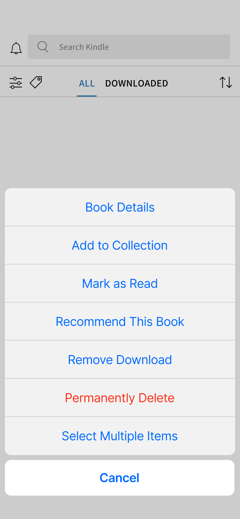
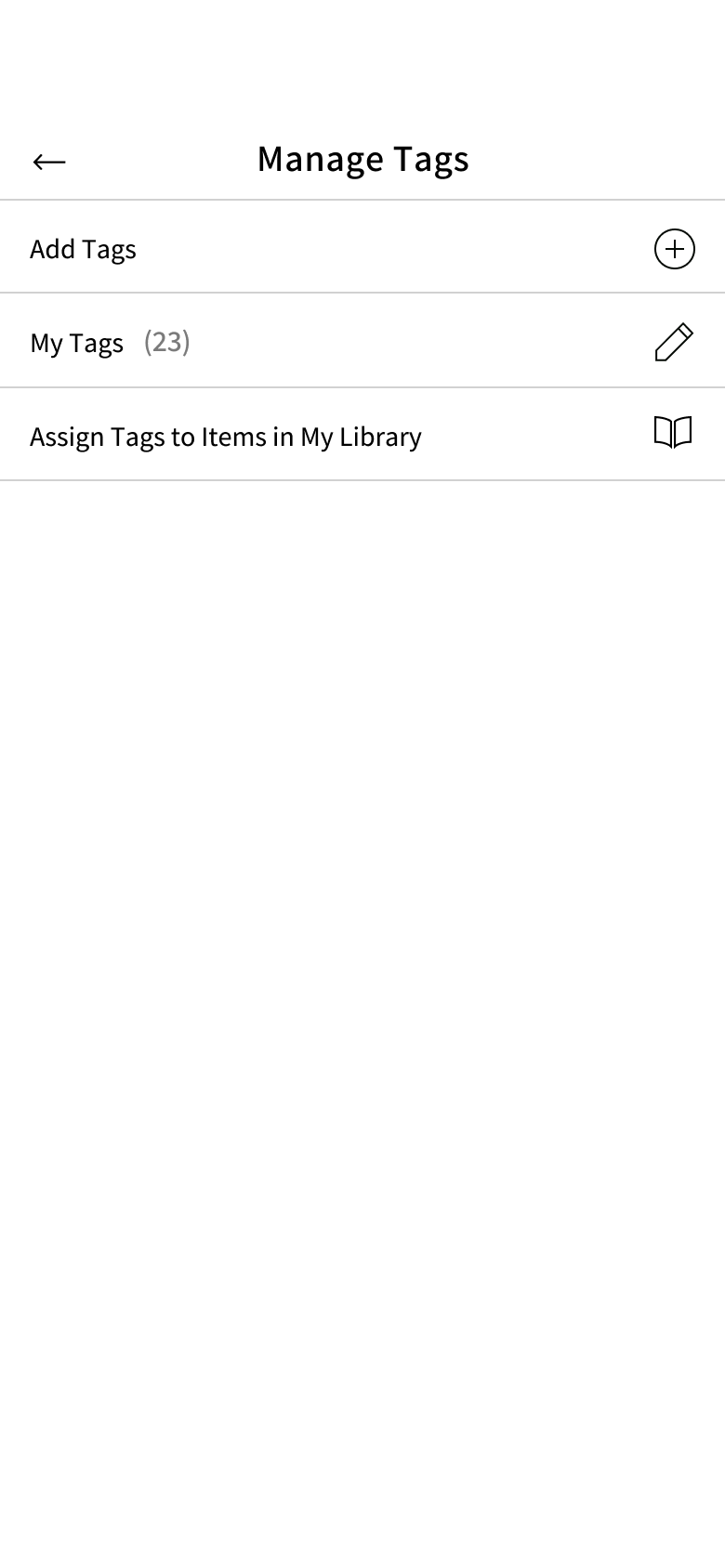
From here, I altered these three base screens to include the tagging feature. As you can see below, these changes are small and intended to fit seamlessly within the established design.
I established a strong foundation during the process pictured above which I used to finish creating my mid-fidelity screens.
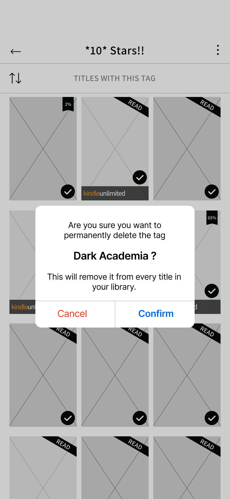
For this project in particular, I spent a lot of my time at the mid-fi stage because it was more efficient to make additions and changes here than later on in the design process. As I noted earlier, there was a lot of imitation work involved at this point. I wanted to ensure my design fit seamlessly with the authentic Kindle design system so a decent portion of my time went toward this goal as I created the mid-fidelity screens pictured below.
The component library I created for this project based on product screenshots traced in Figma:
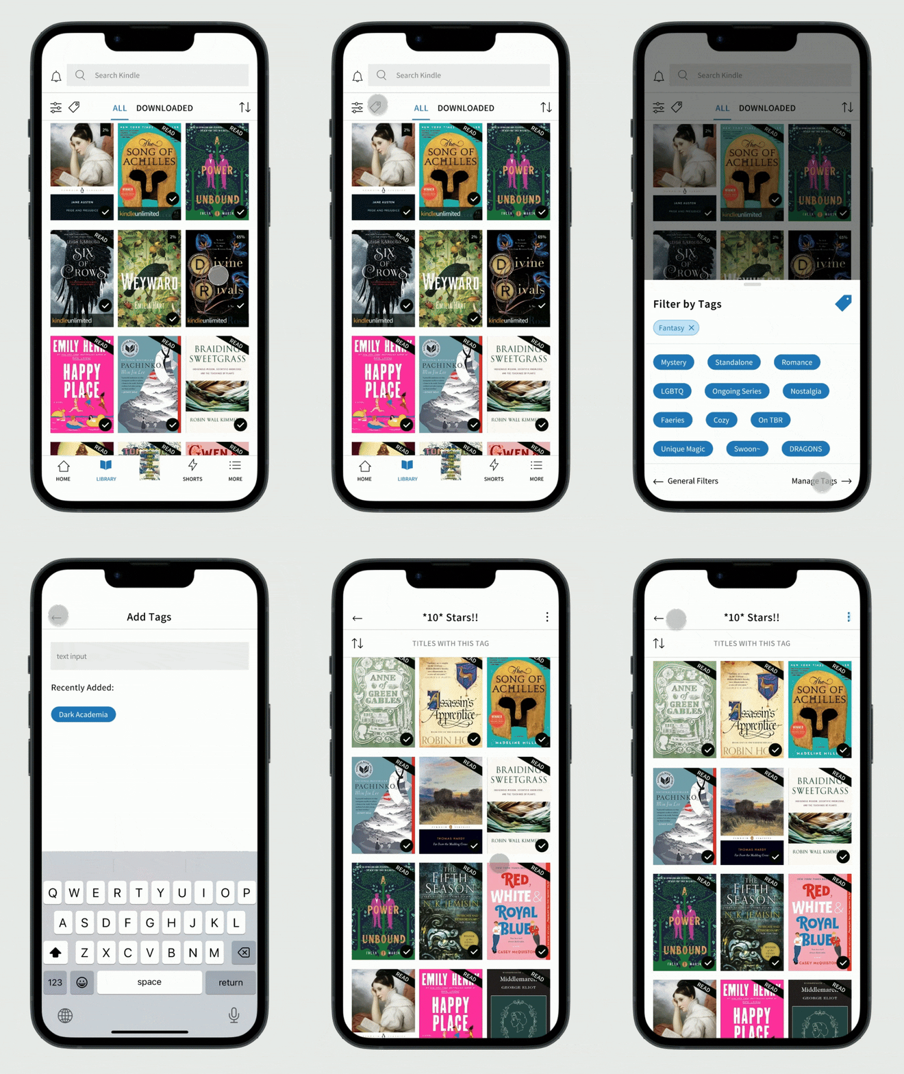
With all the pieces ready, it was time to put together the high-fidelity prototype.
After spending so much time working in mid-fidelity, it was extremely simple to bring things up to high-fidelity. The book cover images are the same covers that would go with the titles in the Kindle store.
The screens below are not comprehensive, please view the prototype to see all of the screens, but note that only specific pathways are interactive, as I will discuss next.
Prototype complete, I was ready to get feedback from usability testing.
I conducted these usability tests with the same individuals I previously interviewed. This meant that all users were already familiar with the Kindle mobile app. This familiarity served as a control variable for these tests because it ensured that any frustrations encountered would be due to the new feature or the nature of the prototype, not that users were unfamiliar with the platform as a whole.
The tasks:
First, users were instructed to add a tag to use when organizing their Kindle libraries.
Second, after creating a new tag, users were asked to assign the tag to multiple items in their library.
The third task participants were given was to manage an existing tag. First, demonstrating how they would remove that tag and, secondly, how they would rename that tag.
The results:
All users were able to complete the given tasks using the prototype. All users were able to finish. In several cases, users did not immediately select the correct element to move forward with the task. At these moments, users employed trial and error to determine what to do next. Much of what could be interpreted as “misclicks” was simply users exploring other elements of the prototype not immediately involved with the task they were given.
Overall I was very pleased with the results of these tests and I consider the product to be a success. Most of the frustration users expressed during the testing was related to the natural constraints of a prototype, not the product being prototyped. Every participant in these tests, all of them frequent users of the Kindle mobile app, expressed their wish that this tagging feature would one day be added to the Kindle mobile experience.
Due to the success of my usability testing, the iterations I made before completing the project were minimal, mostly polishing small things.
In conclusion.
This project was very informative. Creating something new within an established design system was a completely different approach to UX/UI than I experienced before and it was very enjoyable. As I didn’t have to focus much on the UI, I could really dedicate my time to the function and experience this new feature would bring Kindle users.
I think it goes without saying that I would love a tagging feature or something similar to be added to Kindle in the future. One reason I found this project so enjoyable was because this is something I would use constantly if it existed. I’m looking forward to more projects like this in the future.


